개발 공부 일지/앱
앱 화면 만들기 화면을 구성하는 엘리먼트들
- -
반응형
처음부터 빈 페이지에 그림을 그려 나가려는 습관보다는 잘 짜여 있고, 존재하고 있는 좋은 코드들을 가져다가 잘 조합해서 쓰고, 이 코드들을 가지고 잘 응용하는 게 제일 중요하다.
<View></View>
화면의 영역(레이아웃)을 잡아주는 엘리먼트이다.
현재 App.js 상에서 View는 화면 전체 영역을 가진다.
우리는 이 View 엘리먼트로 다음과 같이 화면을 원하는 대로 분할할 수도 있다.
더보기
import { StatusBar } from 'expo-status-bar';
import React from 'react';
import { StyleSheet, Text, View } from 'react-native';

export default function App() {
  return (
    <View style={styles.container}>
      <View style={styles.subContainerOne}></View>
      <View style={styles.subContainerTwo}></View>
    </View>
  );
}

const styles = StyleSheet.create({
  container: {
    flex: 1,
    backgroundColor: '#fff',
  },
  subContainerOne: {
    flex:1,
    backgroundColor:"yellow"
  },
  subContainerTwo: {
    flex:1,
    backgroundColor:"green"
  }
});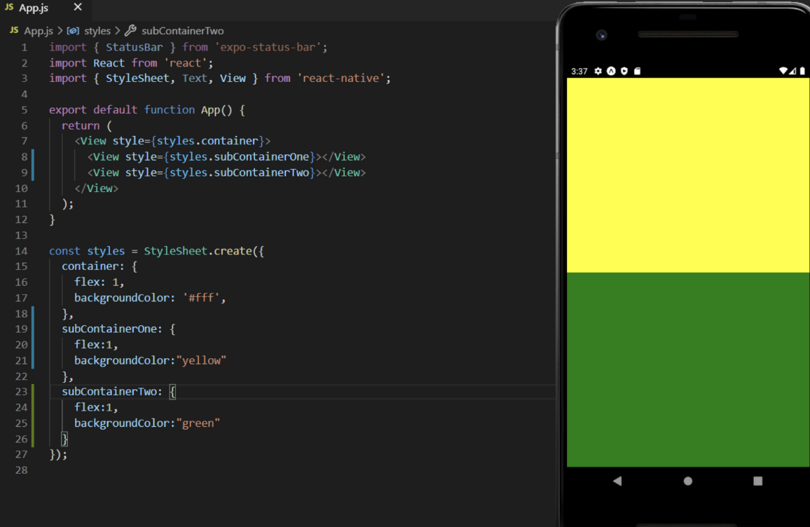
하지만 View로 화면을 분할하고 영역을 잡아나가려면 스타일 문법(StyleSheet)과 같이 사용해야 가능하다.
여기서 View는 화면의 영역을 잡는 엘리먼트라고만 알아두고, 강의를 진행하며 자세히 다루면서 연습해보자!
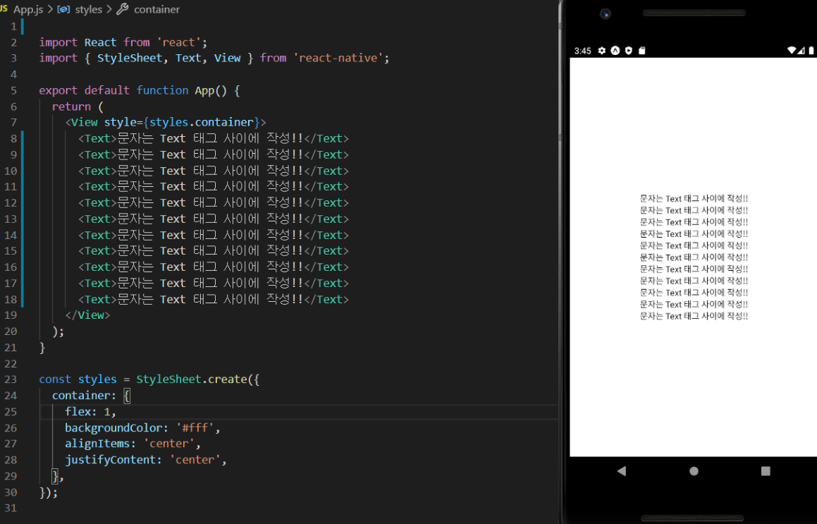
<Text>
앱에 글을 작성하려면 반드시 사용해야 하는 엘리먼트이다.
방금 전 위에서 배운 View 엘리먼트 안에서 문자를 작성하면 오류가 발생한다.
더보기
import React from 'react';
import { StyleSheet, Text, View } from 'react-native';

export default function App() {
  return (
    <View style={styles.container}>
      <Text>문자는 Text 태그 사이에 작성!!</Text>
      <Text>문자는 Text 태그 사이에 작성!!</Text>
      <Text>문자는 Text 태그 사이에 작성!!</Text>
      <Text>문자는 Text 태그 사이에 작성!!</Text>
      <Text>문자는 Text 태그 사이에 작성!!</Text>
      <Text>문자는 Text 태그 사이에 작성!!</Text>
      <Text>문자는 Text 태그 사이에 작성!!</Text>
      <Text>문자는 Text 태그 사이에 작성!!</Text>
      <Text>문자는 Text 태그 사이에 작성!!</Text>
      <Text>문자는 Text 태그 사이에 작성!!</Text>
      <Text>문자는 Text 태그 사이에 작성!!</Text>
    </View>
  );
}

const styles = StyleSheet.create({
  container: {
    flex: 1,
    backgroundColor: '#fff',
    alignItems: 'center',
    justifyContent: 'center',
  },
});
<ScrollView>
앱 화면을 벗어나는 영역의 경우 ScrollView 엘리먼트로 감싸면 스크롤이 가능해지면서 모든 콘텐츠를 볼 수 있다.
좀 길어 보이지만 같은 코드 복붙을 여러 번 한 코드이다.
더보기
import React from 'react';
import { StyleSheet, Text, View } from 'react-native';

export default function App() {
  return (
      //각 태그들에는 style이라는 속성을 갖습니다.
      //이 속성은 파일 최하단에 작성한 스타일 코드 객체의 키 값을 부여해
    // 엘리먼트들에 스타일을 줄 수 있습니다.
    //이는 JSX문법을 배우고 난 다음 더 자세히 다룹니다.
    <View style={styles.container}>
         {/* //보인 영역을 갖는 엘리먼트 7가 반복적으로 쓰였습니다. */}
      <View style={styles.textContainer}>
        <Text style={styles.textStyle}>영역을 충분히 갖는 텍스트 입니다!</Text>
      </View>
      <View style={styles.textContainer}>
        <Text style={styles.textStyle}>영역을 충분히 갖는 텍스트 입니다!</Text>
      </View>
      <View style={styles.textContainer}>
        <Text style={styles.textStyle}>영역을 충분히 갖는 텍스트 입니다!</Text>
      </View>
      <View style={styles.textContainer}>
        <Text style={styles.textStyle}>영역을 충분히 갖는 텍스트 입니다!</Text>
      </View>
      <View style={styles.textContainer}>
        <Text style={styles.textStyle}>영역을 충분히 갖는 텍스트 입니다!</Text>
      </View>
      <View style={styles.textContainer}>
        <Text style={styles.textStyle}>영역을 충분히 갖는 텍스트 입니다!</Text>
      </View>
      <View style={styles.textContainer}>
        <Text style={styles.textStyle}>영역을 충분히 갖는 텍스트 입니다!</Text>
      </View>
    </View>
  );
}

//텍스트가 영역을 갖고, 가운데 정렬도 하며, 테두리 스타일을 갖게 끔 하는 코드입니다.
//JSX를 마저 배우고 스타일에 대해 자세히 다루니
//걱정 안해도 좋습니다!
const styles = StyleSheet.create({
  container: {
    flex: 1,
    backgroundColor: '#fff',
  },
  textContainer: {
    height:100,
    borderColor:'#000',
    borderWidth:1,
    borderRadius:10,
    margin:10,
  },
  textStyle: {
    textAlign:"center"
  }
});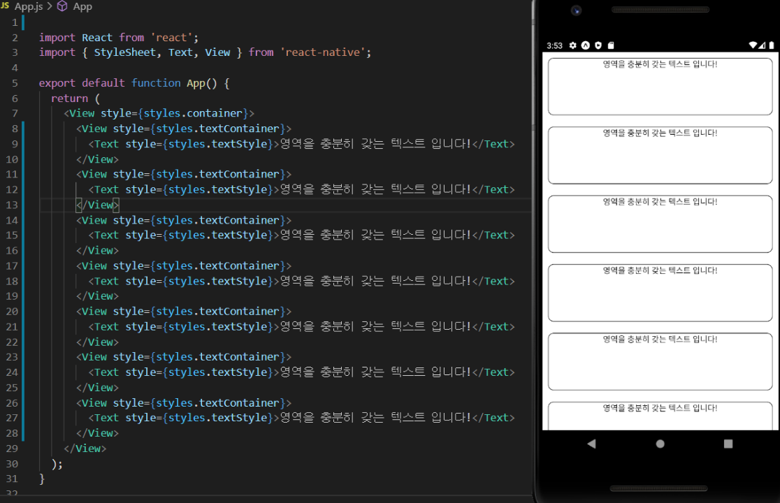
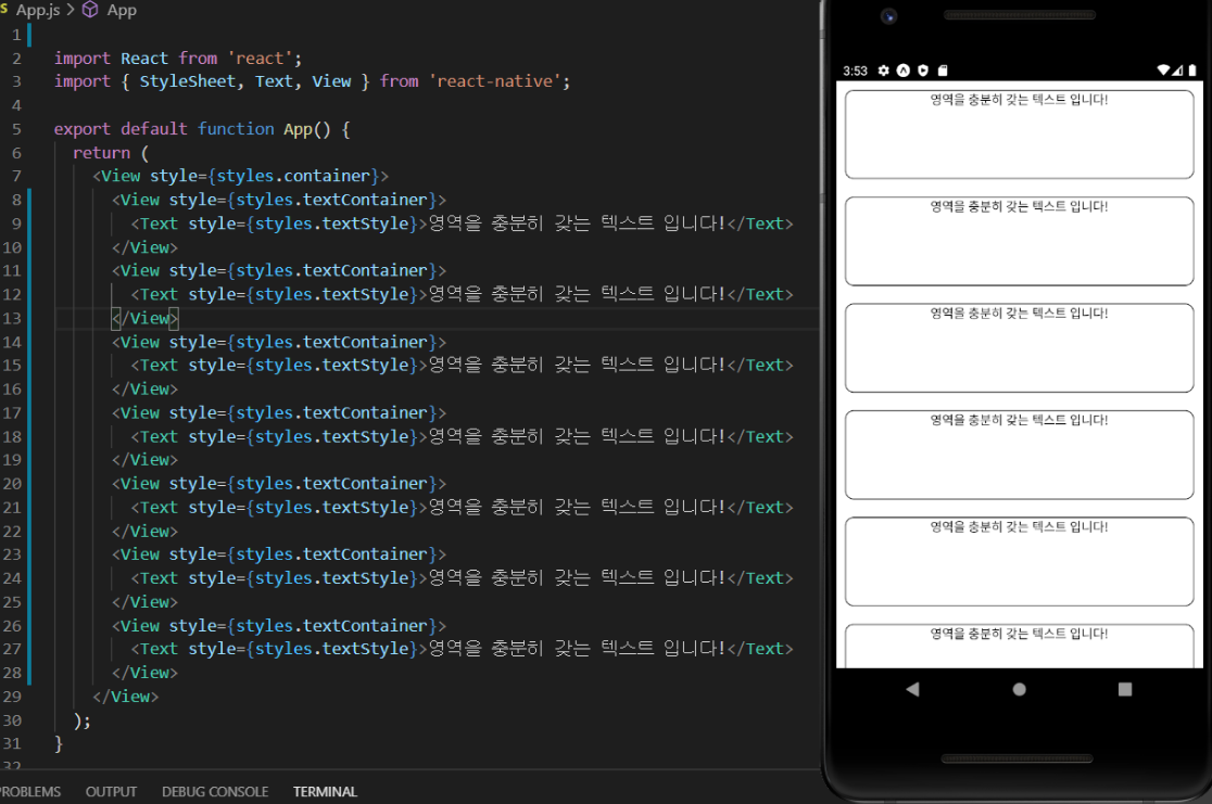
충분히 많은 엘리먼트들을 복붙 했고, 화면에는 마지막 부분이 잘려서 보이질 않는다.
이를 다음과 같이 ScrollView를 상단에서 불러온 다음 전체 엘리먼트를 View 아닌 ScrollView로 감싸 보자!
그러면 화면이 스크롤되면서 가려진 영역을 볼 수 있다.
더보기
import React from 'react';
import { StyleSheet, Text, View, ScrollView } from 'react-native';

export default function App() {
  return (
    <ScrollView style={styles.container}>
      <View style={styles.textContainer}>
        <Text style={styles.textStyle}>영역을 충분히 갖는 텍스트 입니다!</Text>
      </View>
      <View style={styles.textContainer}>
        <Text style={styles.textStyle}>영역을 충분히 갖는 텍스트 입니다!</Text>
      </View>
      <View style={styles.textContainer}>
        <Text style={styles.textStyle}>영역을 충분히 갖는 텍스트 입니다!</Text>
      </View>
      <View style={styles.textContainer}>
        <Text style={styles.textStyle}>영역을 충분히 갖는 텍스트 입니다!</Text>
      </View>
      <View style={styles.textContainer}>
        <Text style={styles.textStyle}>영역을 충분히 갖는 텍스트 입니다!</Text>
      </View>
      <View style={styles.textContainer}>
        <Text style={styles.textStyle}>영역을 충분히 갖는 텍스트 입니다!</Text>
      </View>
      <View style={styles.textContainer}>
        <Text style={styles.textStyle}>영역을 충분히 갖는 텍스트 입니다!</Text>
      </View>
    </ScrollView>
  );
}

const styles = StyleSheet.create({
  container: {
    flex: 1,
    backgroundColor: '#fff',
  },
  textContainer: {
    height:100,
    borderColor:'#000',
    borderWidth:1,
    borderRadius:10,
    margin:10,
  },
  textStyle: {
    textAlign:"center"
  }
});
<Button>과 함수
대부분 앱엔, 버튼이 당연히 있다. 그리고 그 버튼을 누르면 팝업이 뜨기도 하고, 다른 페이지로 넘어가기도 하며 이 밖의 다양한 기능들이 실행된다.
그 버튼을 손쉽게 화면에 달 수 있다. 다음 코드를 App.js에 넣어주자!
더보기
import React from 'react';
import { StyleSheet, Text, View, Button, Alert } from 'react-native';

export default function App() {
  return (
    <View style={styles.container}>
      <View style={styles.textContainer}>
        <Text style={styles.textStyle}>아래 버튼을 눌러주세요</Text>
        {/* 버튼 onPress 속성에 일반 함수를 연결 할 수 있습니다. */}
        <Button
          style={styles.buttonStyle}
          title="버튼입니다 "
          color="#f194ff"
          onPress={function(){
            Alert.alert('팝업 알람입니다!!')
          }}
        />
        {/* ES6 문법으로 배웠던 화살표 함수로 연결 할 수도 있습니다. */}
        <Button
            style={styles.buttonStyle}
            title="버튼입니다 "
            color="#FF0000"
            onPress={()=>{
              Alert.alert('팝업 알람입니다!!')
            }}
          />
          </View>
    </View>
  );
}

const styles = StyleSheet.create({
  container: {
    flex: 1,
    backgroundColor: '#fff',
  },
  textContainer: {
    height:100,
    margin:10,
  },
  textStyle: {
    textAlign:"center"
  },
});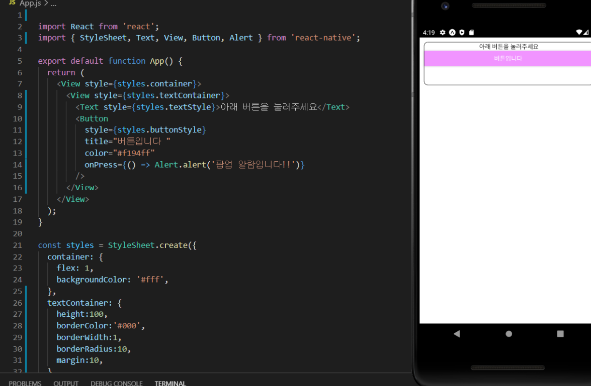
버튼을 눌러보면 팝업 알림이 뜬다.
먼저, 버튼 태그에 title 속성이라던지 color 속성이라던지, onPress 속성들은 어디서 나왔을까? 정말 단순하게 공식문서에 적혀있는 사용법을 그대로 사용했을 뿐이다.
- 버튼 설명서
https://reactnative.dev/docs/button
- 팝업 알람(Alert) 설명서
https://reactnative.dev/docs/alert#docsNav
각 엘리먼트들 마다 고유한 속성 값을 갖는데, 이 속성 값을 잘 이용하여 다양한 기능을 구현할 수 있다.
Button 태그를 예로 들면, 버튼 안에 잇는 문자는 title이란 속성에 값을 넣어서 구현할 수 있고, 버튼 색상은 color 속성에 값을 넣어서 적용할 수 있다.
눌렀을 때 어떤 이벤트가 일어나게 하려면 onPress에 함수를 연결(바인딩)하면 되는데, 이 부분을 좀 더 살펴보자.
다음 두 가지 버튼 구현 방식은 결국 동일한 결과를 보여준다.
더보기
import React from 'react';
import { StyleSheet, Text, View, Button, Alert } from 'react-native';
export default function App() {
return (
<View style={styles.container}>
<View style={styles.textContainer}>
<Text style={styles.textStyle}>아래 버튼을 눌러주세요</Text>
{/* 버튼 onPress 속성에 일반 함수를 연결 할 수 있습니다. */}
<Button
style={styles.buttonStyle}
title="버튼입니다 "
color="#f194ff"
onPress={function(){
Alert.alert('팝업 알람입니다!!')
}}
/>
{/* ES6 문법으로 배웠던 화살표 함수로 연결 할 수도 있습니다. */}
<Button
style={styles.buttonStyle}
title="버튼입니다 "
color="#FF0000"
onPress={()=>{
Alert.alert('팝업 알람입니다!!')
}}
/>
</View>
</View>
);
}
const styles = StyleSheet.create({
container: {
flex: 1,
backgroundColor: '#fff',
},
textContainer: {
height:100,
margin:10,
},
textStyle: {
textAlign:"center"
},
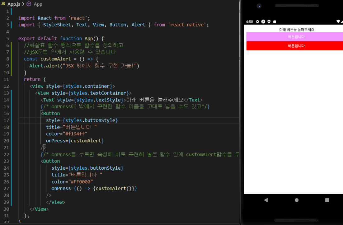
});onPress에 연결한 함수 구현부를 JSX 밖에서 구현한 다음 연결할 수도 있다.
그땐 화살표 함수로 구현하여 함수를 만든 다음 연결해야 한다.
더보기
import React from 'react';
import { StyleSheet, Text, View, Button, Alert } from 'react-native';

export default function App() {
  //화살표 함수 형식으로 함수를 정의하고
  //jSX문법 안에서 사용할 수 있습니다
  const customAlert = () => {
    Alert.alert("JSX 밖에서 함수 구현 가능!")
  }
  return (
    <View style={styles.container}>
      <View style={styles.textContainer}>
        <Text style={styles.textStyle}>아래 버튼을 눌러주세요</Text>
        {/* onPress에 밖에서 구현한 함수 이름을 고대로 넣을 수도 있고*/}
        <Button
          style={styles.buttonStyle}
          title="버튼입니다 "
          color="#f194ff"
          onPress={customAlert}
        />
        {/* onPress를 누르면 속성에 바로 구현해 놓은 함수 안에 customALert함수를 두고 실행할 수 있게도 가능합니다 */}
        <Button
            style={styles.buttonStyle}
            title="버튼입니다 "
            color="#FF0000"
            onPress={() => {customAlert()}}
          />
          </View>
    </View>
  );
}

const styles = StyleSheet.create({
  container: {
    flex: 1,
    backgroundColor: '#fff',
  },
  textContainer: {
    height:100,
    margin:10,
  },
  textStyle: {
    textAlign:"center"
  },
});
앞으로 다양한 앱의 기능을 구현할 때 버튼과 함수 연결(바인딩)은 중요한 개념이다.
위에서 구현한 방법대로만 구현하면 어렵지 않게 여러 기능을 화면에 연결할 수 있다.
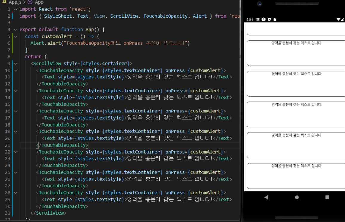
<TouchableOpacity/>
Button 엘리먼트는 본인의 영역을 갖는다.
그렇기 때문에 스타일에도 신경을 써야 하고 ScrollView에서 처럼 카드 형식으로 만든 다음 화면 같은 경우엔 버튼 태그를 사용하기 어렵다.
저 영역을 충분히 갖는 텍스트 카드 부분을 눌러야 할 때 말이다!
이럴 때 사용하는 게 TouchableOpacity 엘리먼트이고, 이 영역은 스타일은 주지 않은 이상 화면에 영향을 주지 않는 영역을 갖는다.
무슨 말이냐면 아까 ScrollView 코드를 다시 App.js에 옮기고 다음과 같이 각 카드의 View 부분을 TouchableOpacity로 변경해보자.
이것저것 배우느라 정신없지만 천천히! 코드를 옮겨가며 진행해보자!
더보기
import React from 'react';
import { StyleSheet, Text, View, ScrollView, TouchableOpacity, Alert } from 'react-native';

export default function App() {
  const customAlert = () => {
    Alert.alert("TouchableOpacity에도 onPress 속성이 있습니다")
  }
  return (
    <ScrollView style={styles.container}>
      <TouchableOpacity style={styles.textContainer} onPress={customAlert}>
        <Text style={styles.textStyle}>영역을 충분히 갖는 텍스트 입니다!</Text>
      </TouchableOpacity>
      <TouchableOpacity style={styles.textContainer} onPress={customAlert}>
        <Text style={styles.textStyle}>영역을 충분히 갖는 텍스트 입니다!</Text>
      </TouchableOpacity>
      <TouchableOpacity style={styles.textContainer} onPress={customAlert}>
        <Text style={styles.textStyle}>영역을 충분히 갖는 텍스트 입니다!</Text>
      </TouchableOpacity>
      <TouchableOpacity style={styles.textContainer} onPress={customAlert}>
        <Text style={styles.textStyle}>영역을 충분히 갖는 텍스트 입니다!</Text>
      </TouchableOpacity>
      <TouchableOpacity style={styles.textContainer} onPress={customAlert}>
        <Text style={styles.textStyle}>영역을 충분히 갖는 텍스트 입니다!</Text>
      </TouchableOpacity>
      <TouchableOpacity style={styles.textContainer} onPress={customAlert}>
        <Text style={styles.textStyle}>영역을 충분히 갖는 텍스트 입니다!</Text>
      </TouchableOpacity>
      <TouchableOpacity style={styles.textContainer} onPress={customAlert}>
        <Text style={styles.textStyle}>영역을 충분히 갖는 텍스트 입니다!</Text>
      </TouchableOpacity>
    </ScrollView>
  );
}

const styles = StyleSheet.create({
  container: {
    flex: 1,
    backgroundColor: '#fff',
  },
  textContainer: {
    height:100,
    borderColor:'#000',
    borderWidth:1,
    borderRadius:10,
    margin:10,
  },
  textStyle: {
    textAlign:"center"
  }
});
이렇게 만든 임의의 영역과 디자인에 버튼 기능을 달고 싶을 때 주로 사용하게 될 태그이다.
<Image>
앱에 이미지도 넣어보자!
두 가지 방식이 있는데, assets 폴더에 있는 이미지를 가져와서 사용하는 방법과 (import),
외부 이미지 링크를 넣어서 사용하는 방식이다(uri).
assets 폴더에 있는 이미지 가져와 사용하기
더보기
import React from 'react';
import { StyleSheet, Text, View, Image } from 'react-native';
//이렇게 상단에 가져와 사용할 이미지를 불러옵니다
import favicon from "./assets/favicon.png"

export default function App() {
  return (
    <View style={styles.container}>
         {/*이미지 태그 soruce 부분에 가져온 미지 이름을 넣습니다 */}
      <Image
        source={favicon}
            // 사용설명서에 나와 있는 resizeMode 속성 값을 그대로 넣어 적용합니다
        resizeMode={"repeat"}
        style={styles.imageStyle}
      />
    </View>
  );
}

const styles = StyleSheet.create({
  container: {
    flex: 1,
    backgroundColor: '#fff',
    //혹시 미리 궁금하신 분들을 위해 언급하자면,
    //justifyContent와 alignContent는 영역 안에 있는 콘텐츠들을 정렬합니다
    justifyContent:"center",
    alignContent:"center"
  },
  imageStyle: {
    width:"100%",
    height:"100%",
    alignItems:"center",
    justifyContent:"center"
  }
});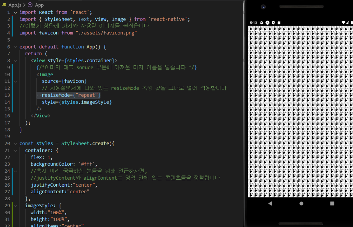
Expo 로고가 assets 폴더에 들어 있길래, 해당 이미지를 사용했다.
캡처를 보면 로고가 여러 번 반복되어 있는데, 그 이유는 <Image> 태그의 resizeMode 속성에 repeat을 줬기 때문이다.
다른 속성 값을 넣으면 어떻게 될까?
사용 설명서를 보고 적용해보자!
-Image 태그 사용 설명서
https://reactnative.dev/docs/image#docsNav
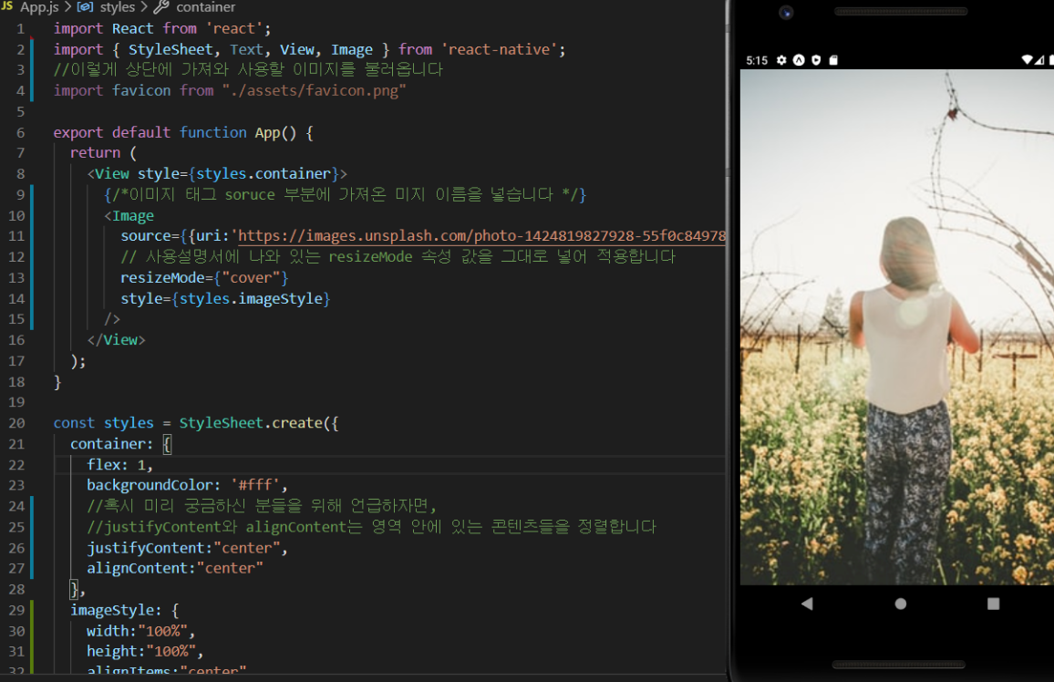
외부 이미지 사용하기
외부 이미지를 사용할 땐 source 부분에 uri를 사용하면 된다.
그리고 resizemode에 방금 전 사용했던 repeat 말고 cover라는 값을 넣어 보면 어떻게 될까?
더보기
import React from 'react';
import { StyleSheet, Text, View, Image } from 'react-native';
//이렇게 상단에 가져와 사용할 이미지를 불러옵니다
import favicon from "./assets/favicon.png"

export default function App() {
  return (
    <View style={styles.container}>
         {/*이미지 태그 soruce 부분에 가져온 미지 이름을 넣습니다 */}
      <Image
        source={{uri:'https://images.unsplash.com/photo-1424819827928-55f0c8497861?fit=crop&w=600&h=600%27'}}
            // 사용설명서에 나와 있는 resizeMode 속성 값을 그대로 넣어 적용합니다
        resizeMode={"cover"}
        style={styles.imageStyle}
      />
    </View>
  );
}

const styles = StyleSheet.create({
  container: {
    flex: 1,
    backgroundColor: '#fff',
    //혹시 미리 궁금하신 분들을 위해 언급하자면,
    //justifyContent와 alignContent는 영역 안에 있는 콘텐츠들을 정렬합니다
    justifyContent:"center",
    alignContent:"center"
  },
  imageStyle: {
    width:"100%",
    height:"100%",
    alignItems:"center",
    justifyContent:"center"
  }
});
모든 태그에 공통적으로 있는 styles 속성
엘리먼트들 즉 태그들에 스타일을 주기 위해서 파일 하단에 코드를 작성해 두었었다. 다음과 같이!
태그에 스타일을 주는 방식 또한 리액트 네이티브에서 제공하는 StyleSheet 기능을 가져와 적용한다.
이 StyleSheet은 결국 객체(딕셔너리)를 하나 만드는데, 이쁜 옷들을 정리해 놓는 객체이다.
이 객체에 옷을 사용법대로 생성한 다음 잘 정리해 두고, JSX 엘리먼트에서 사용하면 된다.
사용할 땐 모든 태그에 공통적으로 있는 style 속성에 아래서 만든 객체 키값을 부여하여 적용한다.
가장 바깥에 있는 View 태그를 보면 다음과 같이 styles 속성에 styles 객체 container 키를 연결한 것을 확인할 수 있다.
<View style={styles.container}>
이렇게 영역에 옷을 입혀주기만 하면 이쁜 화면이 나온다.
그럼 이제 엘리먼트에 줄 수 있는 옷들을 한번 살펴보자!
화면을 꾸며주는 StyleSheet 문법
자주 사용하는 스타일 속성
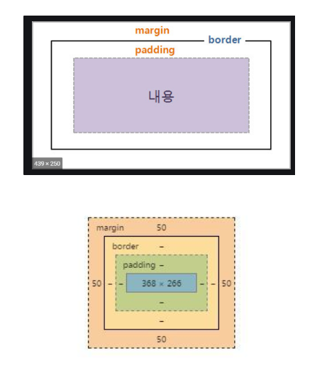
margin과 padding은 다음 이미지들처럼, 영역의 바깥과 안의 여백을 결정한다.
그럼 margin과 padding을 늘려보고 줄여보면서 확인해보자!
스타일에 대한 속성과, 속성 값은 모든 개발자들이 외우고 있지 않는다. 그때그때 필요한 속성을 검색하고 값도 찾아 사용한다.
너무 외우려고 하지 말고, 이런 게 있구나 그리고 검색하면 되는 구나라고 편하게 마음을 가지시면 된다.
-스타일 공식 문서
https://reactnative.dev/docs/style#docsNav
https://reactnative.dev/docs/layout-props
또는 구글에 " react native [필요한 스타일] " 이런 식으로 검색해도 많은 레퍼런스를 찾을 수 있다.
Flex
앱 화면을 구성할 때 사실 flex가 가장 중요하다고 봐도 과언이 아니다.
영역의 레이아웃을 결정하기 때문이다!
지금 이해가 안 된다고 해서 너무 자책할 필요도 없고, 위에서 배운 스타일 코드들과 달리, flex는 자주 쓰고, 눈으로 확인하는 연습이 좀 수반돼야 손에 익는 문법이기 때문이다.
따라서 지금은 이해되는 대로만 받아들이고, 앞으로 우리가 앱을 만들면서 차차 익숙해져 보자!
일단 flex부터 flex와 같이 사용하는 중요 속성들까지 하나하나 살펴보자!
flex는 영역을 차지하는 속성이다.
상대적인 개념이 좀 들어가는데 아래 코드와 스샷을 참조하자.
더보기
import React from 'react';
import { StyleSheet, Text, View } from 'react-native';

export default function App() {
  return (
    <View style={styles.container}>
      <View style={styles.containerOne}>

      </View>
      <View style={styles.containerTwo}>

      </View>
    </View>
  );
}

const styles = StyleSheet.create({
  container: {
    flex:1
  },
  containerOne: {
    flex:1,
    backgroundColor:"red"
  },
  containerTwo:{
    flex:2,
    backgroundColor:"yellow"
  }
});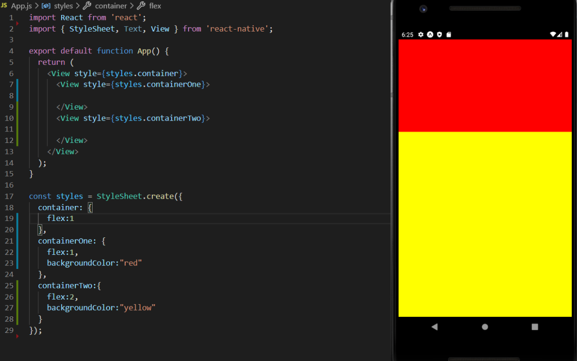
다시 말해 flex는 상대적이다.
가장 최상위의 container 스타일을 가져가는 View 엘리먼트는 디바이스 전체 화면의 영역을 가져간다.
안 쪽의 containerOne 스타일이 부여된 View 엘리먼트는 전체를 3 등분한 뒤 1/3을 가져가고 containerTwo는 2/3를 가져간다.
즉, 같은 레벨의 엘리먼트들의 flex 합을 각자의 flex 속성 값 대로 가져간다. 또 하나 예제를 살펴보자!
더보기
import React from 'react';
import { StyleSheet, Text, View } from 'react-native';

export default function App() {
  return (
    <View style={styles.container}>
      <View style={styles.containerOne}>

      </View>
      <View style={styles.containerTwo}>
        <View style={styles.innerOne}>

        </View>
        <View style={styles.innerTwo}>

        </View>

      </View>
    </View>
  );
}

const styles = StyleSheet.create({
  container: {
    flex:1
  },
  containerOne: {
    flex:1,
    backgroundColor:"red"
  },
  containerTwo:{
    flex:2,
    backgroundColor:"yellow"
  },
  innerOne: {
    flex:1,
    backgroundColor:"blue"
  },
  innerTwo: {
    flex:4,
    backgroundColor:"orange"
  }
});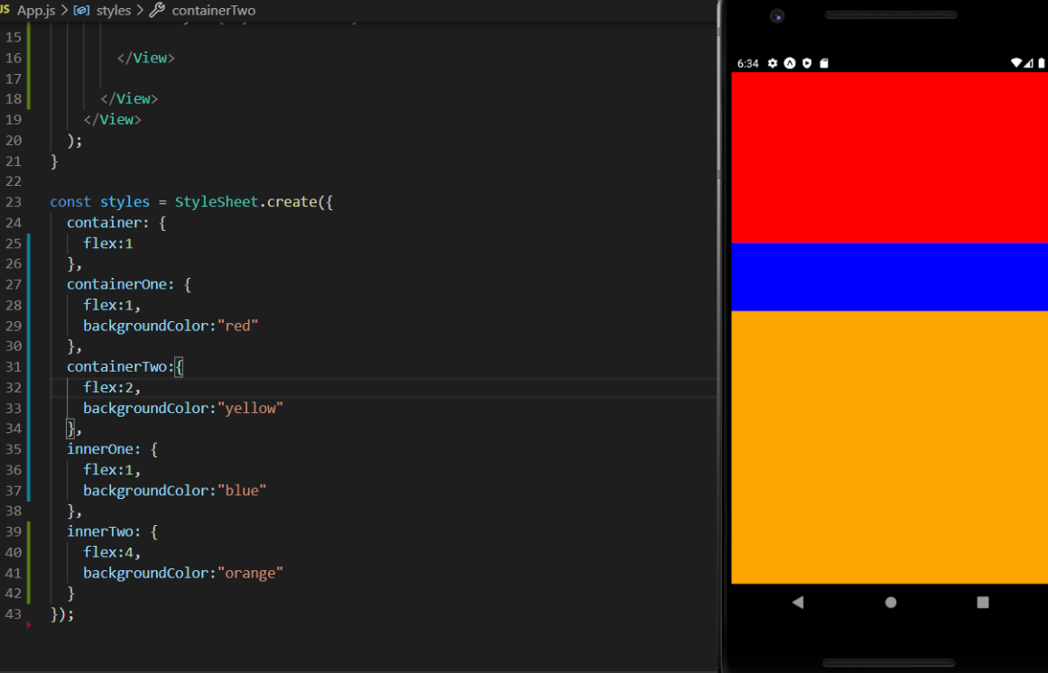
위 예제에서 노란색 영역을 5로 나눈 후, 파란색 영역이 1/5을, 주황색 영역이 4/5를 가져가는 코드이다.
상대적! flex는 위치한 곳의 영역을 같은 레발의 flex합 비율대로 가져간다!
flexDirection
자리 잡은 영역의 방향입니다. 코드로 보면 바로 이해가 된다.
더보기
import React from 'react';
import { StyleSheet, Text, View } from 'react-native';

export default function App() {
  return (
    <View style={styles.container}>
      <View style={styles.containerOne}>

      </View>
      <View style={styles.containerTwo}>
        <View style={styles.innerOne}>

        </View>
        <View style={styles.innerTwo}>

        </View>

      </View>
    </View>
  );
}

const styles = StyleSheet.create({
  container: {
    flex:1
  },
  containerOne: {
    flex:1,
    backgroundColor:"red"
  },
  containerTwo:{
    flex:2,
    flexDirection:"row",
    backgroundColor:"yellow"
  },
  innerOne: {
    flex:1,
    backgroundColor:"blue"
  },
  innerTwo: {
    flex:4,
    backgroundColor:"orange"
  }
});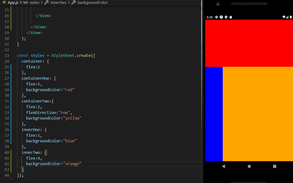
노란색 영역에 넣었던 파랑, 주황 영역이 세로에서 가로 방향으로 영역을 다시 잡은 모습을 확인할 수 있다.
즉, row는 가로 방향, column은 세로 방향으로 영역을 배치한다.
기본 값은 column이다. flex 공부할 때 보면 세로였는데...
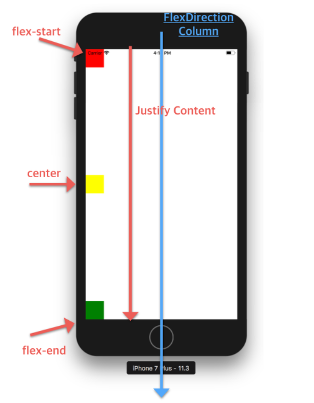
justifyContent
justifyContent는 flexDirection과 동일한 방향으로 정렬하는 속성이다.
flexDirection: 'column'에서 justifyContent는 상하 정렬, flexDirection: 'row'에서 justifyContent는 좌우 정렬을 뜻한다.
flex-start, center, flex-end, space-between, space-around 속성을 가진다.
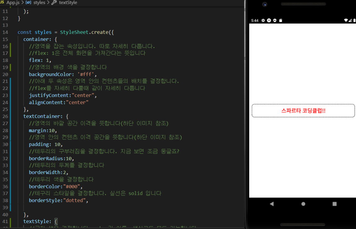
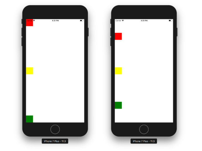
간단한 text를 작성한 다음 적용해보자!
더보기
import React from 'react';
import { StyleSheet, Text, View } from 'react-native';

export default function App() {
  return (
    <View style={styles.container}>
      <View style={styles.containerOne}>

      </View>
      <View style={styles.containerTwo}>
        <View style={styles.innerOne}>

        </View>
        <View style={styles.innerTwo}>
          <Text>!!컨텐츠!!</Text>
        </View>

      </View>
    </View>
  );
}

const styles = StyleSheet.create({
  container: {
    flex:1
  },
  containerOne: {
    flex:1,
    backgroundColor:"red"
  },
  containerTwo:{
    flex:2,
    flexDirection:"row",
    backgroundColor:"yellow"
  },
  innerOne: {
    flex:1,
    backgroundColor:"blue"
  },
  innerTwo: {
    flex:4,
    justifyContent:"flex-start",
    backgroundColor:"orange"
  }
});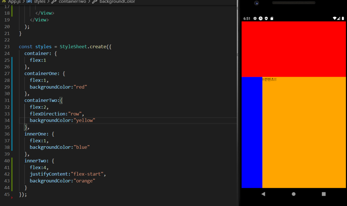
innerOne, Two를 모두 감싸고 있는 containerTwo의 flexDirection 속성 값을 변경하면서, innerTwo의 justifyContent 속성 값을 이리저리 변경해보자!
상위 엘리먼트 영역의 flexDirection을 따라서 콘텐츠 위치도 변경됨을 알 수 있다.
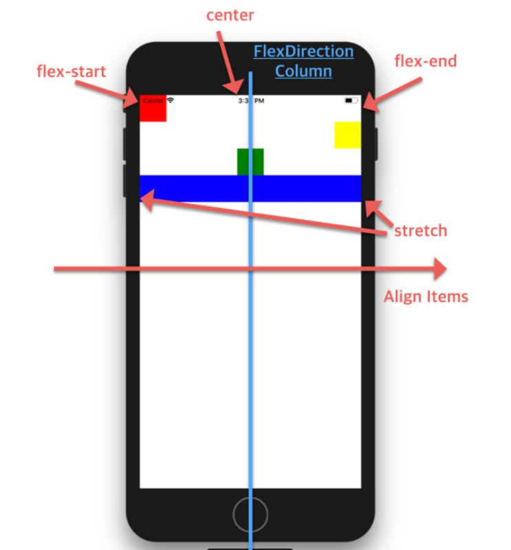
alignItems
Align Items는 Flex Direction과 수직 한 방향(반대 방향이라고 생각하면 편하다)으로 정렬하는 속성이다.
flexDirection: 'column'에서 alignItems는 좌우 정렬, flexDirection: 'row'에서 alignItems는 상하 정렬을 뜻한다
flex-start, center, flex-end, stretch 속성을 가진다.
아래 설명 이미지를 보고 한번 적용해보자!
더보기
import React from 'react';
import { StyleSheet, Text, View } from 'react-native';

export default function App() {
  return (
    <View style={styles.container}>
      <View style={styles.containerOne}>

      </View>
      <View style={styles.containerTwo}>
        <View style={styles.innerOne}>

        </View>
        <View style={styles.innerTwo}>
          <View style={styles.content}></View>
        </View>

      </View>
    </View>
  );
}

const styles = StyleSheet.create({
  container: {
    flex:1
  },
  containerOne: {
    flex:1,
    backgroundColor:"red"
  },
  containerTwo:{
    flex:2,
    flexDirection:"row",
    backgroundColor:"yellow"
  },
  innerOne: {
    flex:1,
    backgroundColor:"blue"
  },
  innerTwo: {
    flex:4,
    backgroundColor:"orange",
    alignItems:"flex-end"
  },
  content: {
    width:50,
    height:50,
    backgroundColor:"#000"
  }
});
이것도 마찬가지고 innerTwo( 상위 엘리먼트 )에 적용을 해야 안에 있는 콘텐츠에 영향이 간다!라는 점 잊지 말자!
필요할 때 그때그때 찾아 쓰다 보면, 언제 뭘 써야 하는지 익혀질 것이다.
반응형
'개발 공부 일지 > 앱' 카테고리의 다른 글
| 앱&자바스크립트 모듈과 반복문 (0) | 2022.09.08 |
|---|---|
| 앱 화면 만들기 메인화면 꾸미기 (0) | 2022.09.08 |
| 앱 화면 만들기 JSX 문법 (0) | 2022.09.07 |
| 리액트 네이티브 = 리액트(React) + 네이티브(Native) (0) | 2022.09.06 |
| 앱개발에 자주 쓰이는 Javascript (0) | 2022.09.02 |
Contents
소중한 공감 감사합니다